Rhythm Healthcare Platform
A clearer care platform for clinicians and patients navigating complex workflows.
- Role
- Product Designer
- Agency
- HueGrid
- Client
- Rhythm Healthcare
- Timeline
- 2024
The short version
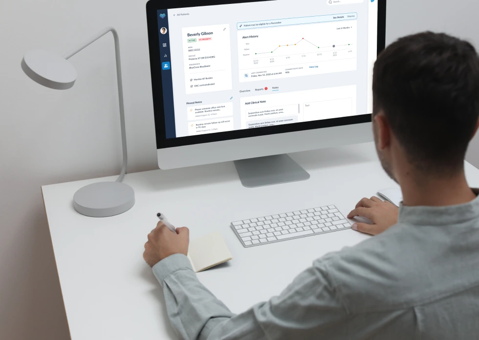
Rhythm Healthcare builds a cardiac rhythm monitoring and remote patient monitoring platform. Clinicians, mostly nurses, use it every day to keep an eye on dozens of patients. When I joined as the only designer, the product worked, but the UI was inconsistent and the design system was split across two different toolkits. Over a year I redesigned the patient overview, unified the system, and shipped changes clinicians noticed.
50%Faster Task Completion
30%Fewer Reporting Errors
1Year, Solo Designer
Both numbers came from clinicians, not a formal study.
Where things stood
- One screen tried to show everything at once: personal info, providers, insurance, and clinical data. Clinicians scan 40+ patients a shift. They need to spot problems fast, not read through a wall of data.
- Design lived in Polaris. Development lived in Chakra UI. Two different systems, two different sets of rules. Every handoff turned into a small translation exercise.
- Nobody had sat down with the nurses using the product daily. The CEO knew the clinical side well, but the interface had never been tested against real workflows.
Fixing it in steps, not guessing
The old patient overview tried to hold everything on one screen. Instead of jumping to a redesign, I broke the work into small steps.
01
Talk to the people who use it
I interviewed three or four nurses and clinicians. Simple conversations about their daily workflow, not a formal study.
02
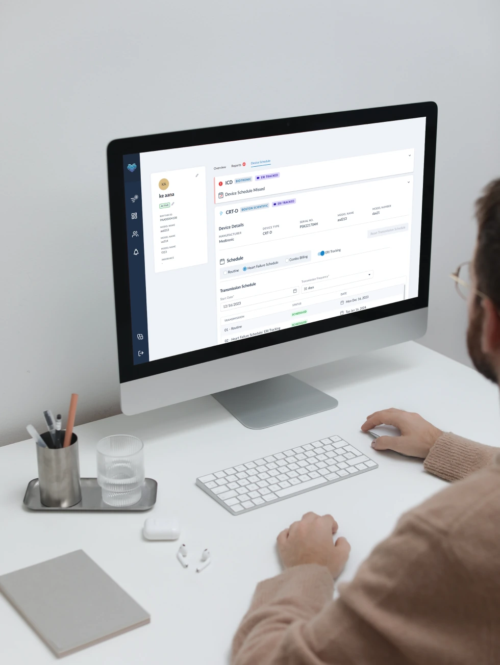
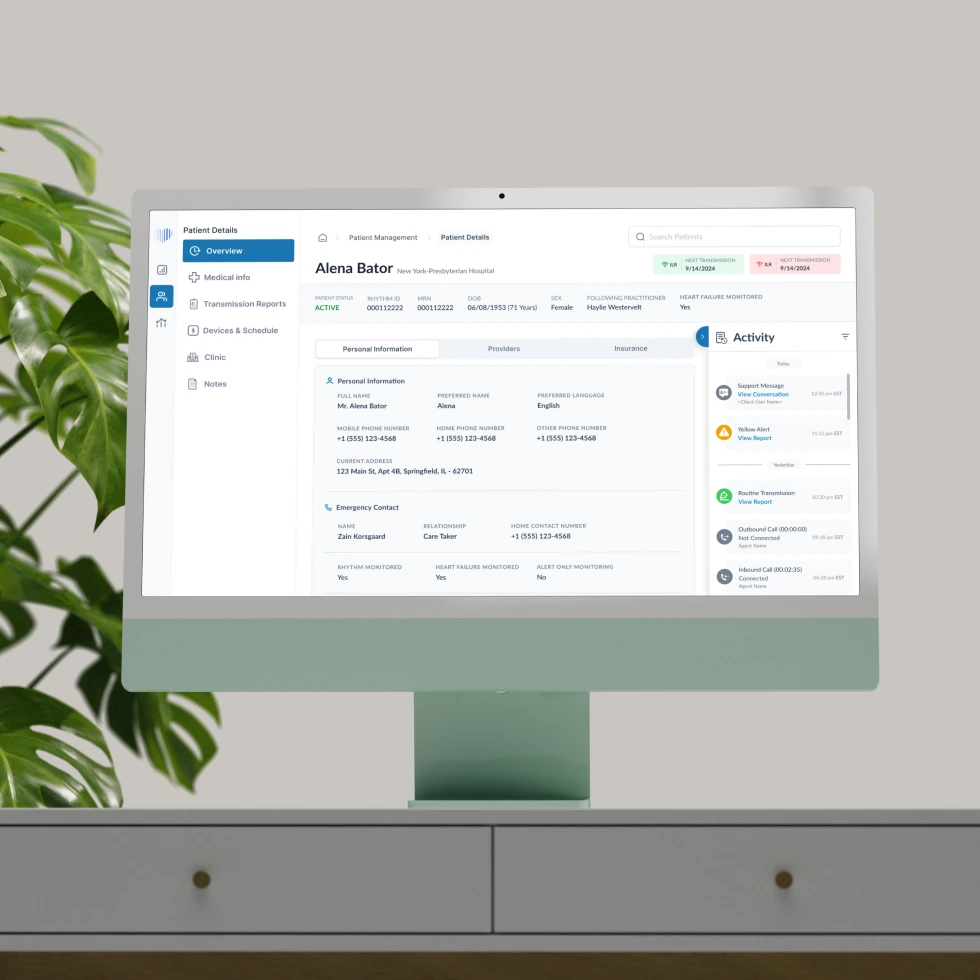
Split the overview into three tabs
Personal info, providers, and insurance each got their own tab, instead of one crowded screen.
03
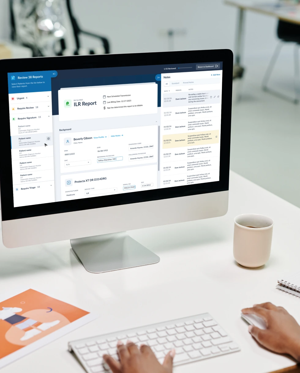
Keep clinical data always visible
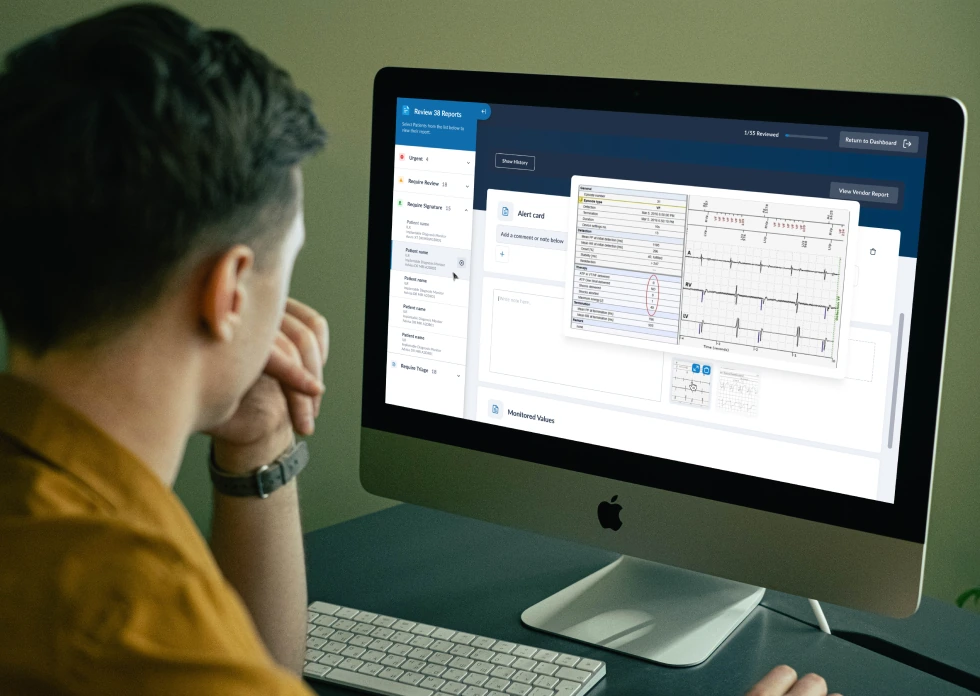
Readings, alerts, and rhythm strips stayed on screen in a panel that never moved, no matter which tab was open.
Two systems, one product
Design lived in Polaris. Development lived in Chakra UI. Different components, different spacing, different behavior. Every handoff turned into a small translation exercise.
Proposing Tailwind, and the compromise
On my own, I went to the development team and proposed moving to Tailwind CSS. They pushed back, fairly: limited time, limited people, and a system that already worked. So I proposed a phased plan instead. New components would be built in Tailwind. Old ones would move over only when they needed updates anyway. That lowered the risk enough to get buy-in.
Clinicians noticed the difference
A clinician told me directly: "You made my work easier." The CEO adopted the 3-tab layout as the standard for every patient-facing screen after that.
50%Efficiency Gain
30%Fewer Reporting Errors
The Tailwind shift, still going
The migration started small and is still running today, one component at a time, without disrupting the clinicians using the product every day.
What it added up to
- A 3-tab patient overview, now the standard pattern for every patient screen
- Clinician-reported gains in speed and accuracy
- A Tailwind migration that started from a proposal, not a mandate
What I learned
Working with a CEO who knows the clinical side deeply is different from working with a product manager. He told me what data mattered and when. Figuring out how to show it was on me. That mix, his domain knowledge and my design judgment, worked better than either of us alone would have.