Back

First Responder Airspace

Operational clarity for airspace coordination when every second matters.

Role
Product Designer
Agency
HueGrid
Client
First Responder Airspace
Timeline
2023–2024

The short version

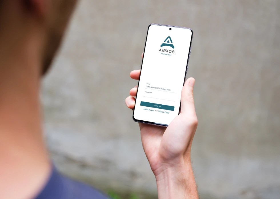
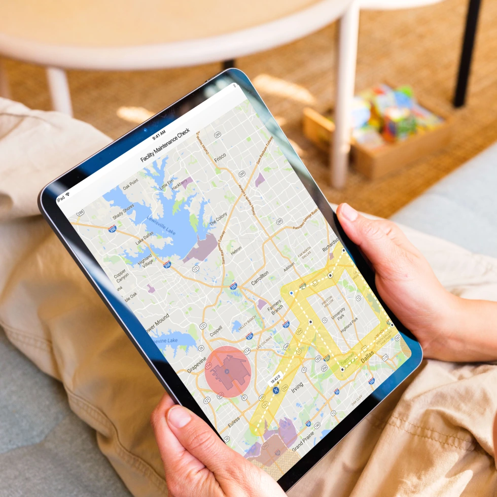
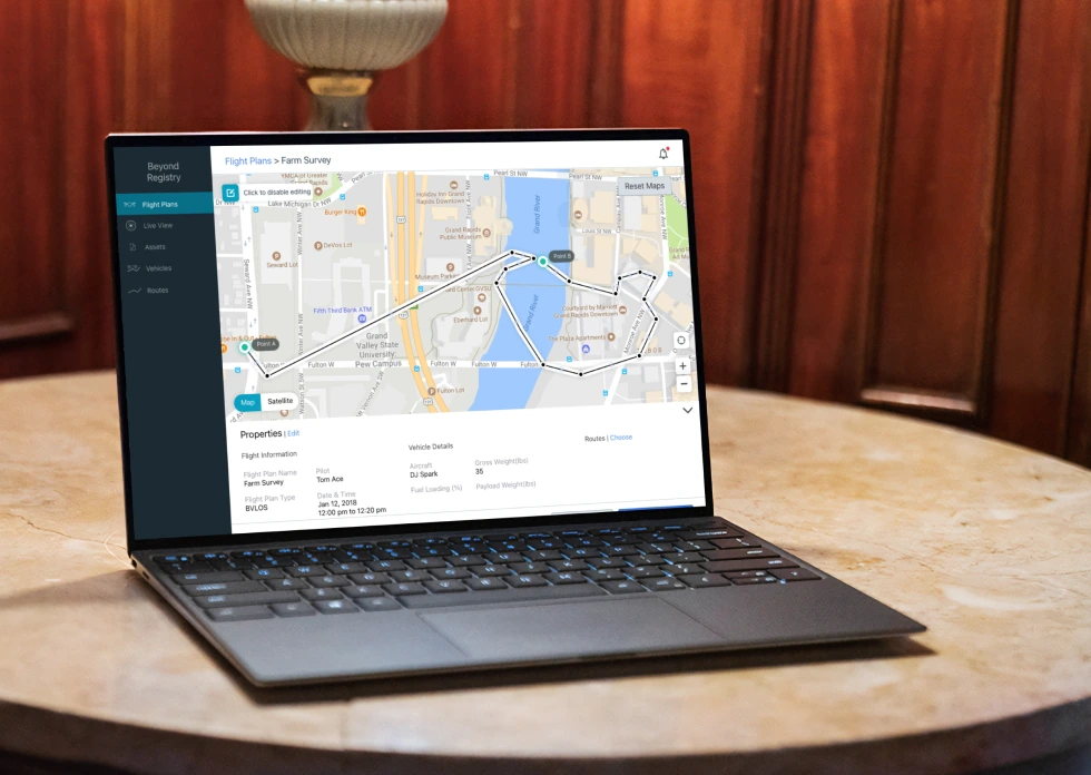
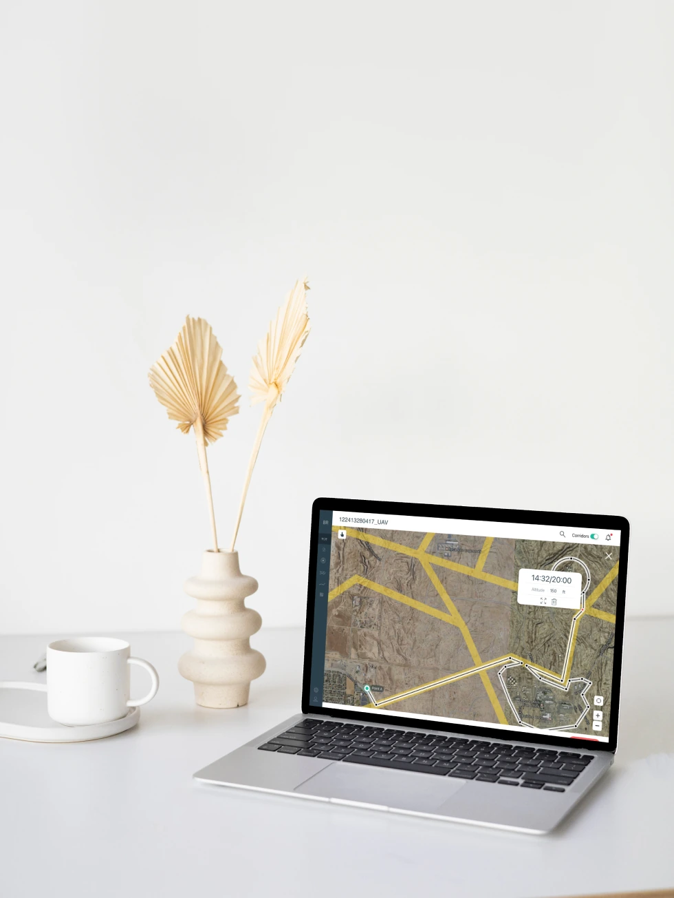
A US government project needed a flight planning tool for first responders, police, firefighters, and ground coordinators managing emergency operations. The product didn't exist yet. I designed it from scratch for web, iPad, and mobile at the same time, working under a design lead.

70%Time Saved
3Platforms, Designed Together
NewBuilt From Scratch

Where things stood

First responders managing aerial operations, search and rescue, disaster response, surveillance, were planning flights with paper forms, phone calls, and fragmented tools. In an emergency, every minute spent planning is a minute not spent responding.

  • No existing product to redesign. This was built from nothing.
  • Two very different users: first responders in the field need quick, glanceable access on mobile. Ground coordinators need the full picture on web or iPad to plan and coordinate.
  • A life-critical context. Errors in flight planning have real consequences, so the interface could not afford to be ambiguous.
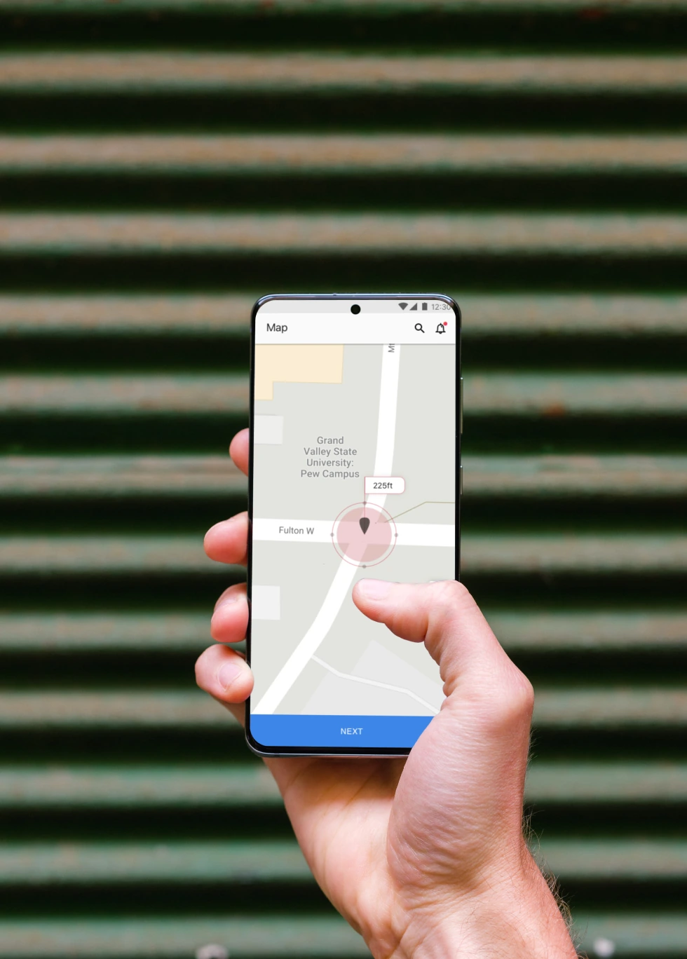
Designing three platforms at the same time

Instead of designing one platform first and adapting it twice, we built web, iPad, and mobile together from day one.


01

Shared components

Buttons, cards, status indicators, and map elements work the same way everywhere.


02

Platform-specific layouts

Web gets full dashboard views. iPad gets touch-optimized panels. Mobile gets single-task screens.


03

One data hierarchy, three displays

The same information priority applies everywhere. What changes is how much of it shows. Mobile users never see the administrative detail that would distract them in the field.

Designing for stress, not calm

First responders do not use software in ideal conditions. That shaped every decision:

  • High contrast, so screens read in direct sunlight
  • Large touch targets, usable with gloves on
  • Minimal text, status shown through color and shape instead of labels
  • A confirmation step on critical actions, to stop an accidental route change mid-operation

Why designing together was harder, but better

Building all three platforms in parallel meant every decision got tested against all three contexts right away. We never shipped a web pattern that could not work on mobile. The shared component library was built cross-platform from day one, not patched together later.

What shipped

The tool shipped across web, iPad, and mobile. US government first responder teams use it for flight planning today.

70%Time Saved
3Platforms Shipped

Designing for the worst case

A mistake in a consumer app just annoys someone. A mistake here means someone makes the wrong call under pressure. That pushed every decision toward the worst-case user, tired, stressed, possibly in danger, not the ideal one.

What it added up to

  • A flight planning tool built from scratch across three platforms
  • One shared design system instead of three disconnected ones
  • An estimated 70% cut in flight planning time compared to the old manual process

What I learned

Designing three platforms together taught me a rule I still use. The smallest screen should shape the information architecture, not the other way around. You cannot design for web first and make it fit on mobile later.

First Responder Airspace visual 1
First Responder Airspace visual 3
First Responder Airspace visual 5
First Responder Airspace visual 2
First Responder Airspace visual 4
First Responder Airspace visual 6

Get in touch

  • Don't be shy, say hi!→

© 2026 Sateesh