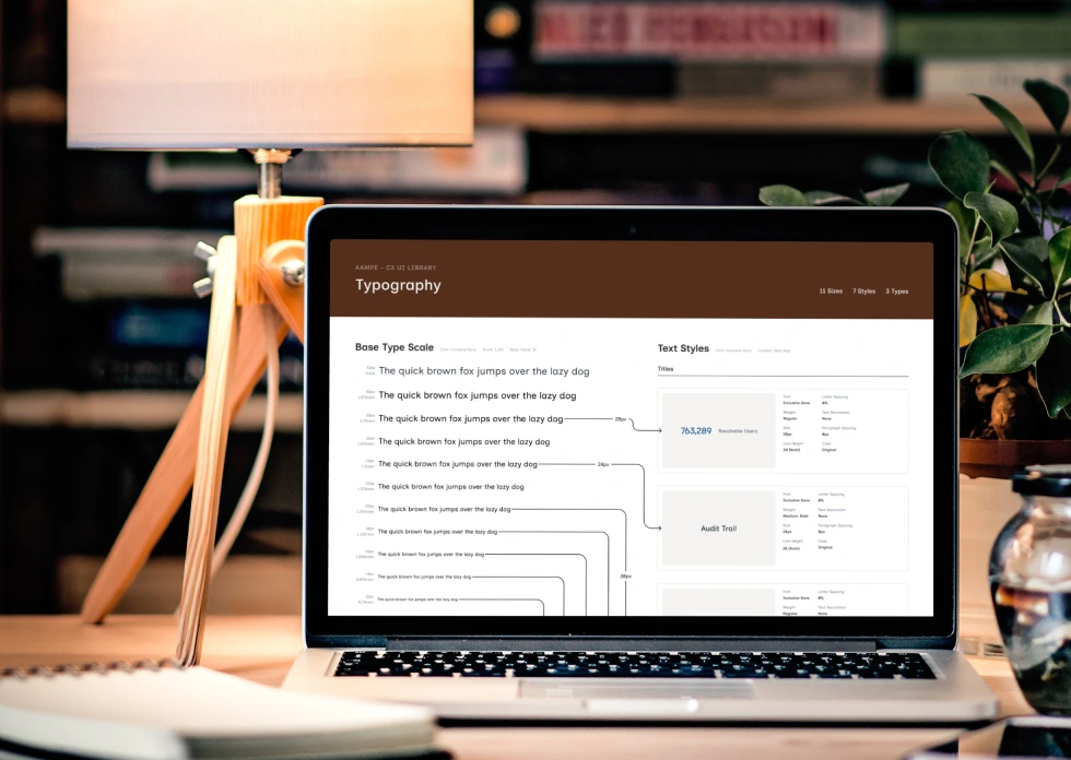
From Early Components to a Scalable Design System
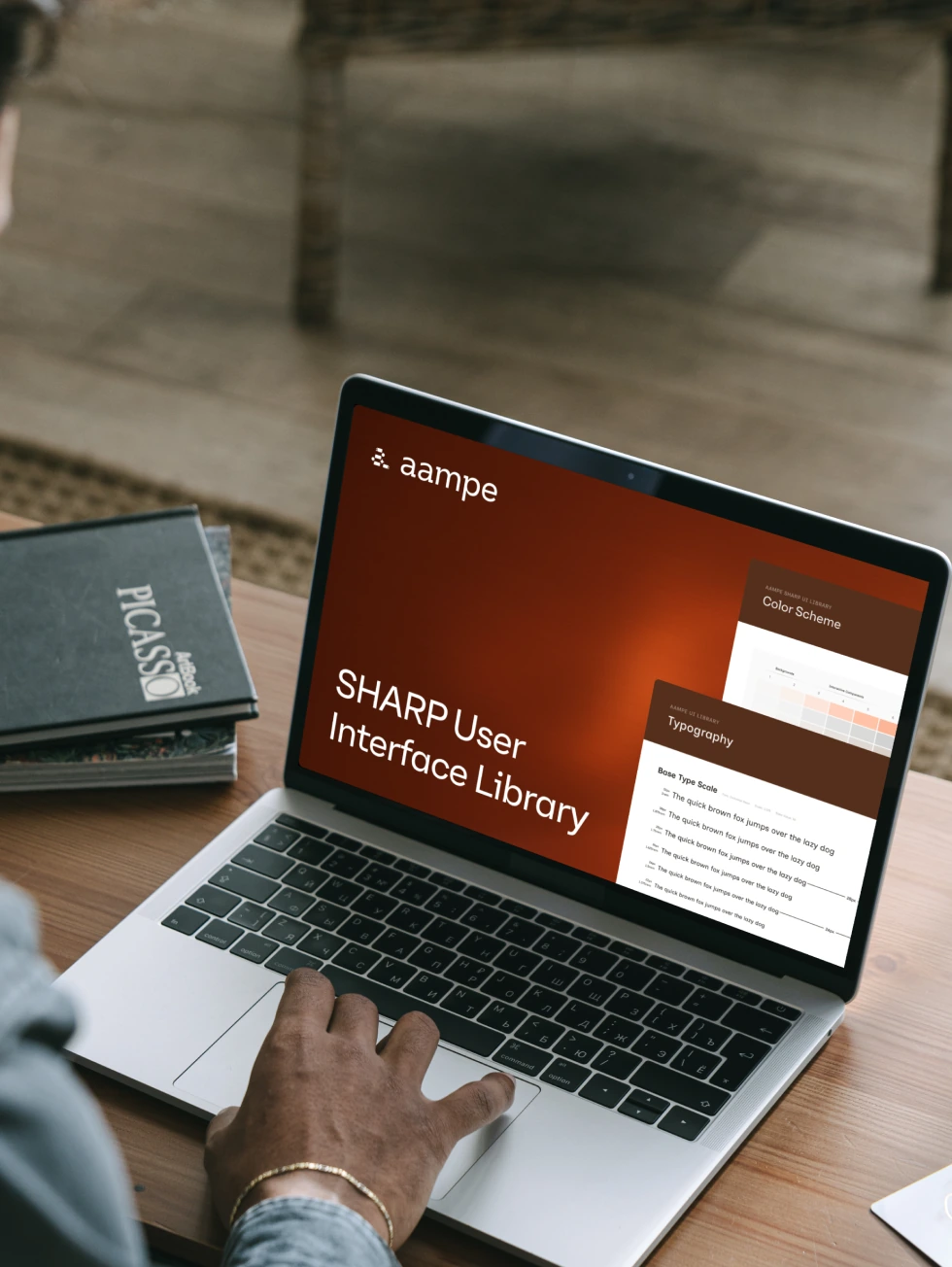
UI Design Library for Aampe, an Agentic Personalisation Platform. Built in phases to support a live product rebrand without disrupting existing users.
- Role
- Design System Designer
- Agency
- HueGrid
- Client
- Aampe
- Timeline
- 2025–present
The short version
HueGrid was brought in to rebrand and redesign the whole Aampe product. Aampe is an AI personalization platform used by growth teams at Swiggy, Glide, and similar companies.
50+Components
60+Figma Variables
L/DLight + Dark
Where things stood
The library had grown on its own over time. Spacing was inconsistent, naming was messy, and colors were hardcoded. Whatever we changed had to work without disrupting the daily workflow of the team.
Doing it in phases
Live clients were using the product every day, so we could not rebuild everything at once. We split the work into phases instead.
01
Build the foundation
We looked at everything first. Tokens, naming rules, and a full list of components.
02
Apply the new brand to old components
Same layouts, same interactions, just a new visual style.
03
Build everything new
New components and new flows, built on top of the phase 1 foundation.
Token structure
- Primitive tokens: raw color values on Radix scales, checked for contrast using APCA.
- Semantic tokens: what each color means in context, like background or text.
- Component tokens: values used by specific components only.
Documentation as handoff
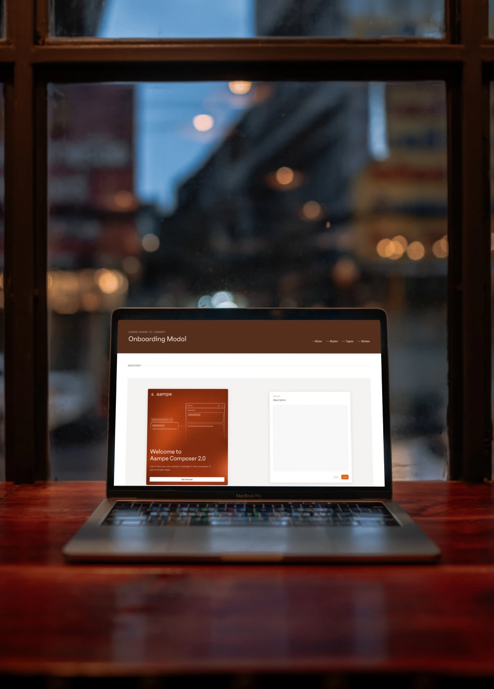
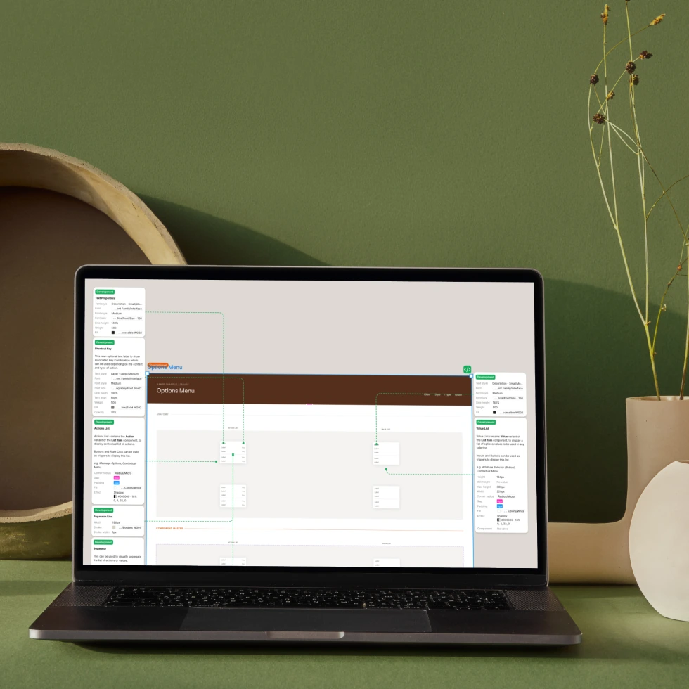
Each component page shows its anatomy, its states, its use cases, and simple do's and don'ts. The documentation page is the spec. Developer questions dropped to almost zero after this.
Three libraries, not one
The work produced three separate design libraries, each a version of the system at a different stage: old brand with polished old components, polished old components with new brand colors, and new components with the new brand.
Developers stopped asking, started building
Before the documentation format, developers needed constant clarification on component behavior. After, they built with full understanding on their own. No back-and-forth needed.
What it added up to
- 50+ documented components across the three libraries
- 60+ Figma variables, covering light and dark modes
- A documentation format adopted as the standard for handoff
Giving credit where it's due
ArjunPhlox led the brand strategy. My part was building the system that keeps everything consistent as the product grows.